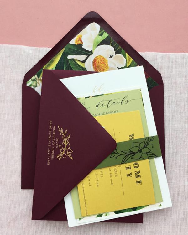
Brooke and Don were hosting their wedding weekend in Tulum, Mexico and wanted their invitations to be sophisticated, romantic, bohemian and with hints of traditional Mexican design. To achieve a more sophisticated palette, we avoided vibrant festival colors, and found inspiration in the region's natural settings for a bold color scheme.

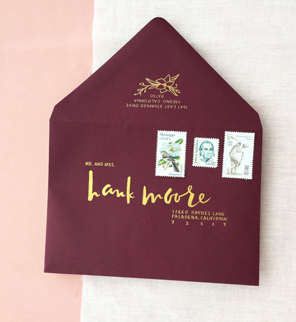
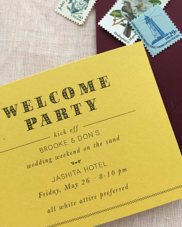
For a dramatic first impression, we used moody, wine-colored envelopes that were hand-addressed in gold brush ink by Jaymie Eaton. I still can’t get over how precise her lettering is for the guests’ addresses! The return address and floral illustration was foil-stamped in gold on the back, and our vintage stamps showcased in high-contrast against the dark envelope.
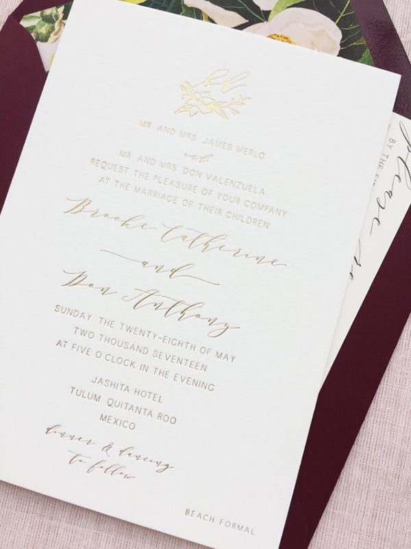
For the invitation, we knew we wanted to set a loose but luxurious tone. We created a full gold foil design on double-thick 100% cotton Lettra paper, used a minimalistic sans serif type along with a romantic script. To add an organic touch, I hand-illustrated a floral mini-wreath to frame their monogram.
The laser-printed postcard and envelope liner was a great opportunity to inject color and lush botanicals into the suite. On both pieces, we used a tropical John James Audubon print with natural tones that served as a color source for the rest of the suite.

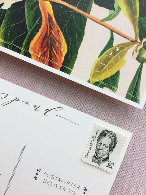
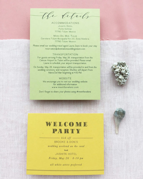
The Welcome Party card was laser-printed in charcoal on mustard card stock, with a festive, folksy-headline font and the details card was laser-printed on palm green card stock. On each of these pieces, we incorporated graphic details inspired by Mexican folk embroidery -- delicate lines of diamond “stitching” and tiny decorative designs to offset important text.
The entire suite was packaged-up with an olive green belly band, laser-printed in charcoal with our illustrated florals. The end result is full of color, but true to the sophisticated palette that inspired by the lush tropics of Central America.
