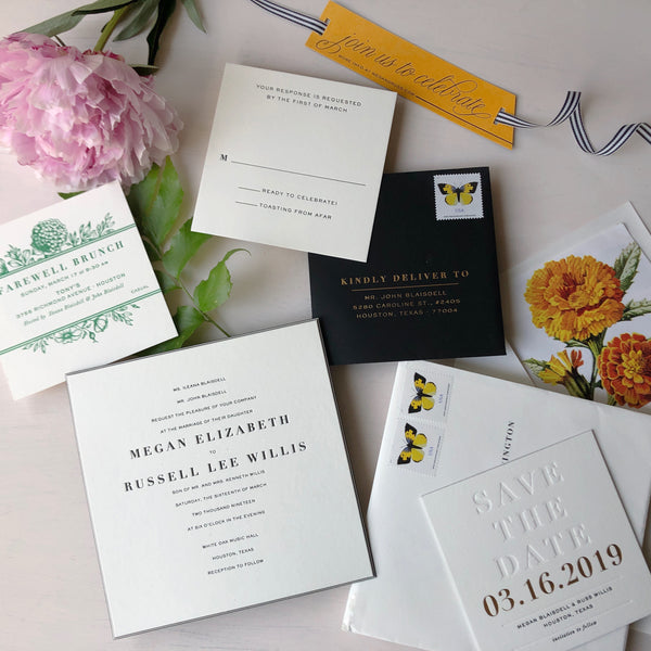
Working on this wedding invitation suite was a serious treat. Megan and Russ are great friends of ours and not a single minute of this felt like work. In fact, Megan's clear vision and creative trust really allowed me to create something timeless with unconventional details.
Her wedding inspiration was Veuve Clicquot's Polo Classic, an iconic event known for its fresh flowers, trademark yellow, dappled with the springiest greens and pinks. We focused on white, black, "Veuve" yellow and embraced blind debossed elements to achieve negative space. In my opinion, nothing feels as luxurious as crisp white. Walls. Sheets. Paper!
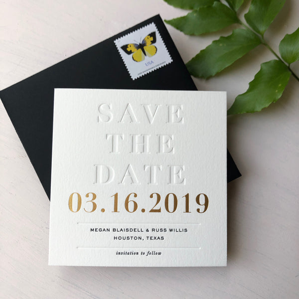
For the Save the Date, we wanted something impactful, but didn't want to fully show our hand on color and creative direction. We did a square Save the Date with big, gorgeous blind debossed letters, gold foil date and minimal, black letterpress text. The piece was printed on 220c Lettra paper, with black 130c paper laminated to the back, to yield a thick and sexy piece of mail.
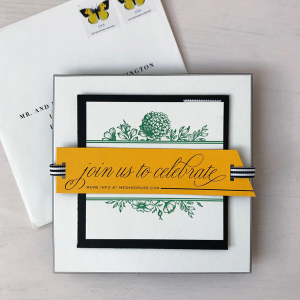
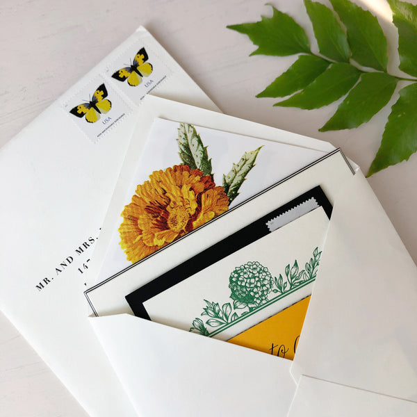
The square stack presentation was strategically designed to line-up and make even the most OCD get a hit of serotonin. Our custom die-cut tag was Veuve yellow with black laminated on back, and it was foiled-stamped with a black flourished script. The classic black and white striped ribbon thread through the tag, then layered on the green floral brunch invite, the black RSVP envelope & card, and finally framed by the white wedding invitation.
Favorite technical detail: Striped beveled edges on the invitation. White cotton paper, laminated on black, laminated on white and then again on black, hand-beveled to reveal the stripe effect. When I received this final product from the beveler, I nervously FaceTimed Megan to unbox. THE UNBOXING DID NOT DISAPPOINT. So pleased with how this turned out.
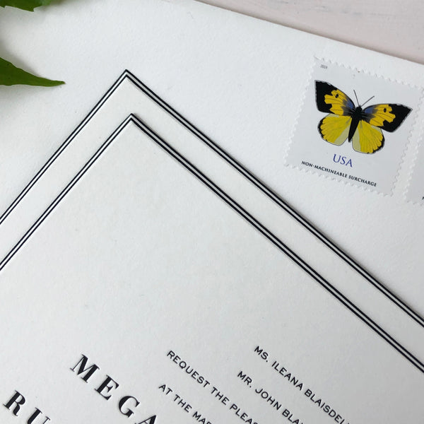
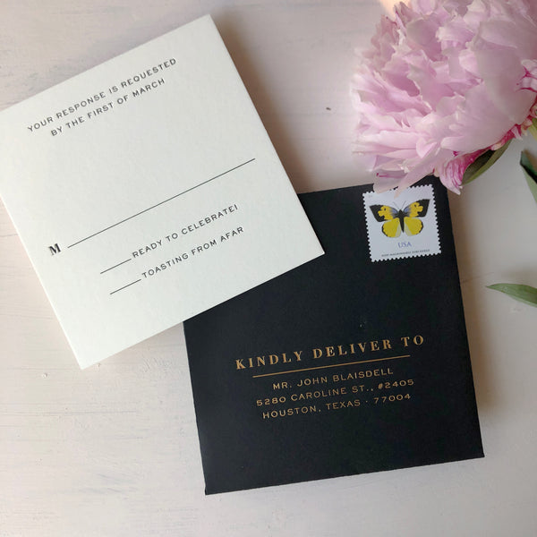
The RSVP set continued the square motif, and embraced the white space with clean, minimal black letterpress. A dramatic black envelope was foil-stamped for a little element of glam. We lucked out with USPS's release of the California Dogface Butterfly stamp. Square in shape, and yellow in color, we could not have designed a better postage companion for this floral-inspired suite.
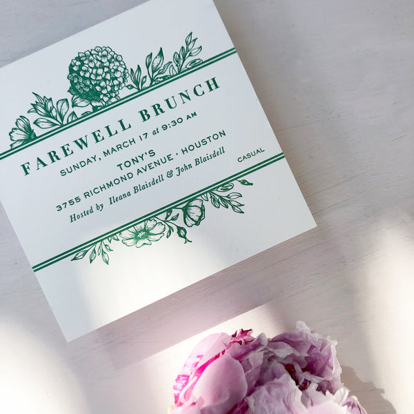
Our morning-after brunch was another opportunity to inject a little color and feminine graphics into the suite. Letterpressed on 100% cotton paper, the intricate floral illustrations created a tactile experience for the invitation recipient. We incorporated the stripe element on this piece, that would ultimately frame the invitation's yellow tag, when assembled.
For our invitation envelope, we found a vintage gold zinnia illustration to bring in some more Veuve's lovely golden yellow. So obsessed with how everything turned out. And you know what? The wedding was a BLAST. Congrats, Mae Mae & Russ!
For custom wedding invitation, contact Lauren at Charm & Fig.
