Justine and Thomas were having a Long Island summer wedding, so we started off with a muted beachy palette - dusty blues, grays and gold foil. For the invitation we created a clean, nautical monogram that we could use on place cards, welcome itineraries and fun wedding day pieces.

On the invitation, we did full gold foil for that extra wow factor! We alternated between a clean, mid-century type and classic script that was just a little reminiscent of Wes Anderson's The Life Aquatic. Our dusty-blue envelope was lined with a graphic, yet neutral banana leaf liner - a fun way to add some beachy elements with distracting too much from the invitation.

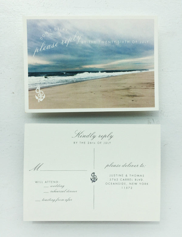
We used a vintage beach photo for the RSVP Post Card and muted the colors to keep it inline with our sun-bleached palette. And here's a little trick -- we printed two versions of the RSVP post card: one with a rehearsal line and one without. The rehearsal RSVP is shown below:
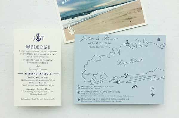
All invitations included a custom Long Island wedding map in the invitation, complete with a weekend itinerary - printed on our trusty, dusty blue paper.
Once the guest arrived at their hotel, they received a more detailed itinerary for the wedding weekend (shown left).
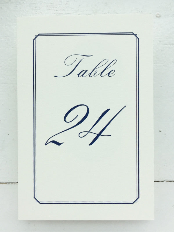
For the table numbers, we opted for a simple navy with the same clean border from the invitation. I loved how everything came together!
For custom wedding invitations, contact Lauren at Charm & Fig.