Charm & Fig — letterpress
molly + nik's letterpress marriage announcements
Lauren Covington Announcement botanical Emboss envelope liner floral letterpress lettra Wedding Zoffany
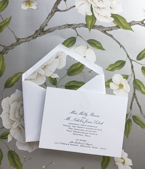
Molly and Nik planned to have a private ceremony for their nuptials, but they opted for some pretty paper to share the news. As a interior designer, Molly had the genius idea to use a botanical wallpaper for her envelope liners. She selected Zoffany's gorgeous Romy's Garden pattern in silver - with blooming cream peonies, playful insects and barely-blush sprigs of blooms, it was a super sweet homage to new beginnings. For the card, we used double-ply 100% cotton Lettra paper, letterpressed it with a green-toned black ink, and blind-embossed the couple's monogram at top center. I just love how crisp and clean these...
alice + henri's pink and green palm springs wedding invitations
Lauren Covington banana leaf California Green invitation Letterpress lettra luxury wedding monogram Palm Palm Springs Pink save the date square envelope Wedding wedding paper
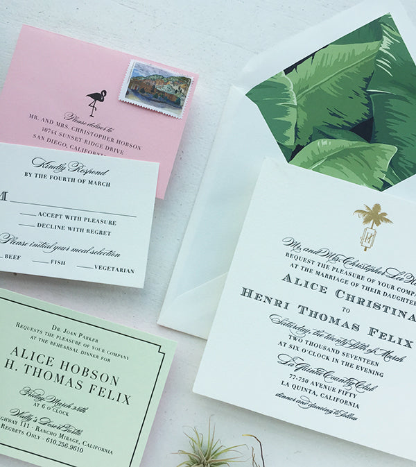
Alice came to me loving my previous banana leaf print invitations, and we tweaked it with pops-of-pink for a full-on Palm Springs vibe. For the Save the Date, we did banana leaf border card that was die-cut with a cool mid-century shape and pink envelope liner. Simple, chic, and just a taste of what's to come for the invitation... The invitation itself was straightforward and luxurious, with a gold foil monogram and black letter-pressed text. The square shape made it dramatic and unique, and the banana leaf envelope liner brought some lush color to the suite. We brought in our...
kira + trey's tropical letterpress and rose gold invitations
Lauren Covington calligraphy charm & fig custom destination wedding foil letterpress luxury wedding mexico olive rose gold tropical wedding invitation wedding monogram
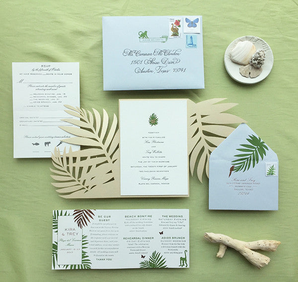
When I first met with Kira and Trey, the top priority for the couple was to create a welcoming invitation that had hints of festive, tropical graphics and understated elegance for their four day celebration in the Mexican Riviera Maya. For the color palette, we steered clear of typical over-saturated “fiesta” colors, and selected natural, sunbleached colors accented by soft metallics. We honored Mexico’s flora and fauna by incorporating lush palms and sweet little animals throughout the invitation. No time was wasted to profess our love of tropical creatures -- we letterpressed a mischievous monkey on the dusty-blue envelope to...
tonia & troy's navy and gold west palm beach wedding invites
Lauren Covington banana leaf beach wedding destination wedding flamingo Florida florida wedding foil print formal wedding Gold gold foil letterpress luxury wedding monogram Navy pineapple tropical wedding invitation wedding monogram West Palm Beach
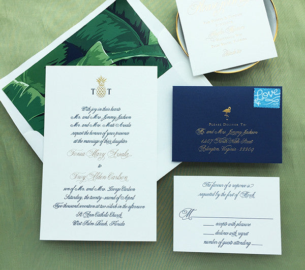
Tonia and Troy set out to have a fabulous black tie West Palm Beach wedding, so we pulled out all the stops with a full script invitation printed with navy letterpress gold foil stamping. We added super chic golden pineapples and flamingos, against a lush banana leaf print to give the formal invitation a touch of Southern Florida personality. Researching locations and prints for this wedding suite left me aching for a girls weekend in West Palm Beach. Insert all the tropical emojis... !!!! Sometimes a stationer gets really lucky with symmetrical letters for a monogram. We mixed the navy letterpress and gold...
kristen + michael's gold, rose gold & blush wedding invitations
Lauren Covington blush charm and fig foil galveston gold invitation letterpress luxury wedding nautical rose gold
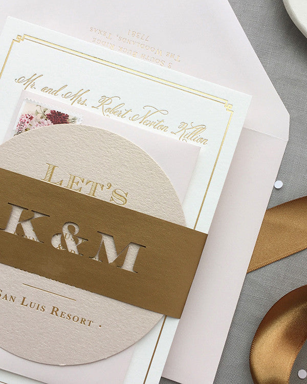
Kristen and Mike tied the knot in the seaside city of Galveston, Texas on the weekend before Valentine's Day. As we brainstormed for their suite, they wanted it to be luxurious, romantic, beachy, and not overly formal. Gold foil and mix-and-match textures were a top priority. The invitation was gold foil-stamped on double-ply Lettra paper and duplexed with a metallic rose gold paper to give it extra thickness and texture. While the calligraphy font brought a major femininity factor, we consciously opted for a heavier block text on other pieces to bring in more masculinity. I always call the reception...